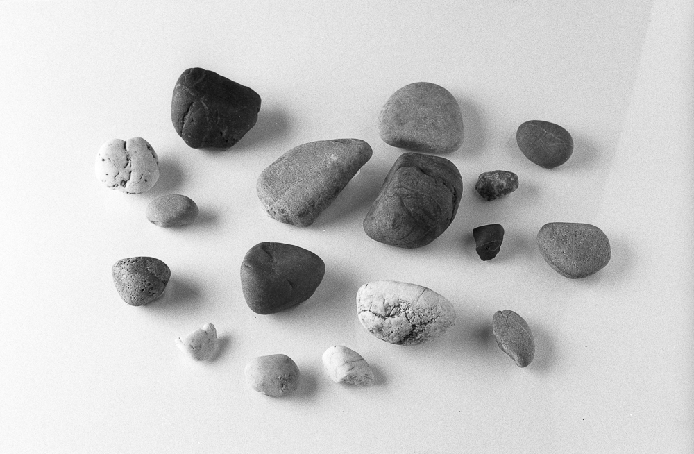
In this instalment of Pebble Project I present four examples of FP4+ in different developers. In a sense, the results here speak for themselves and the reader is invited to draw his / her own conclusions. That said, I’d like share a little commentary of my own as guidance, especially for the reader who is less experienced in film use. This is a job of interpretation, and as such carries the usual caveat that your impressions may differ.
My thoughts
You will see immediately that different developers have differing effects on similarly exposed film shots (which these are). This phenomenon is a big part of the joy film, its flexibility and potential to be shaped as the user wishes. There are different areas which we could focus on in interpreting the results. I made a list, and then printed the images so I could do a little table-top assessment. I decided to make things interesting by hiding the developers from myself (easy enough, given the degree of similarity of the shots), therefore doing a roughly ‘blind’ test.
First I asked myself about sharpness. I went backwards and forwards, and then backwards and forwards. I didn’t feel confident that I had reached a clear conclusion on this. On the one hand, this points to just how close some these developers come, on the other it might point to unaccounted for variables (like focus variation). I had, as it turns out, settled on the Perceptol sample as the ‘sharpest’, followed by LC29 and Ilfosol S together, with DDX last. I had firmly expected Ilfosol S to be the sharpest, given my experience of using this developer with Delta 100. Ilford don’t list Perceptol as being noted for sharpness. I don’t think DDX is generally known for sharpness, so it is perhaps not a surprise that I rate this last.
Next I tackled fine grain. I regarded DDX as the best (i.e. least grainy), followed by Ilfosol and Perceptol together, and LC29 last or ‘most grainy’. We’re not dealing with grain like golf balls here, far from it, but this is also not Delta 100 grain, which I consider to be finer. I think this conclusion is in keeping with what Ilford would say.
My next category was longest tonal range. I accept that this might be skewed by exposure issues (see notes below). My impression was that the longest march from deep tones to still palpable light ones went to Perceptol and LC29 together. Ilfosol I placed after, with DDX last, insomuch as it has a mid to light tonal range in which the extremities of tone don’t feature. Put differently, we could say DDX has a very open tonality. Ilford say that DDX provides the best overall image quality for liquid developers with FP4+. Perhaps this open tonality figures for them.
I then thought about the most open shadows, having in mind landscapes and other such images where blocked up shadows are a problem. I have hinted at my impression, namely that DDX has the most open shadows, followed by Ilfosol, Perceptol and LC29 in that order. Ilfosol sits in my mental map as something of a contrasty developer, and so I was a little surprised by this, and might have expected Perceptol to figure more highly. DDX gives a speed increase, so this again may account for the more generously exposed darker tones.
The quickest to lose the highlights I saw as clearly Ilfosol, although I am not sure I can usefully distinguish between the others. This is more in keeping with my own impression of Ilfosol as a sharpness enhancing developer that be difficult to print if the shots were made in high contrast light (I am referring to 35mm, somewhat loosely metered and metered from experience, rather than a careful zone system style placement and development regime). FP4+ has a ‘shoulder’ on its contrast curve, and so should deliver very manageable highlights. My results do nothing to contradict this.
Lastly, I thought about mid tone contrast. I went with LC29 and Perceptol together first (i.e. most mid tone contrast), followed by Ilfosol and then DDX. I have used LC29 a lot with HP5 plus and am used to seeing good negatives with plenty of contrast. I have always thought of Perceptol as rather smooth, but my experience is mainly with HP5 plus.
What does this mean so far?
Well, if there is any objectivity here (I hope there is some), then I have seen that some very well established ideas about FP4+ and its developers have been confirmed. I have also had some of my assumptions challenged, and, for me, this would now have an impact on my shooting and developing choices. I haven’t shot very much FP4+ in the grand scheme of things and am already beginning to cook up some uses. I must acknowledge that looking at studio test shots is not the same as looking at a contact print of ‘real’ images. The alchemy of film aside, these results do provide me some food for thought, and I hope this instalment offers you something useful too.
Where to now?
There are more developers to try with FP4+. These I will add to the start made above. I think it is right to compare other similar speed films, and Delta 100 is the obvious candidate, which I shall move on to next. Another legitimate option is to compare different speed films in the same developer. I may do this relatively quickly too, because it might prove more accessible to those who have not shot too much film. A beginner might quite rightly ask, if I buy one bottle of developer, which films might I explore for different conditions? I have started with a relatively arcane scenario by taking one film and comparing it to itself differently developed. Watch this space.
Technical points to note
I was looking at gloss inkjet prints, made on an Epson P600 machine, using Epson’s Advanced Black and White print driver. The print medium and driver play their part in the results. I was conscious of some differences between print and screen, as I would expect. Were darkroom prints to be made from the original negatives (here scanned on a Nikon Coolscan machine), the paper and development choices would be an influencing factor too. There is no ‘actual’ negative, other than, well, the actual negative! When we print, with combine parts that work on one another.
Where I am citing Ilford I am referring to relevant datasheets. These are excellent and provide lots of useful information that anyone interested in these matters should consult.
My development times are ‘standard’ (and convenient) ones given by Ilford. I have not used any ‘exotic’ variations, for example greater dilution and stand development. I reason that the Ilford times and dilutions make a great baseline should other recipes be explored. There are many such recipes in the film using community, and often these are cherished and highly personal.
I gave the Perceptol sample twice the exposure, given that it is a speed reducing developer. DDX is known as a speed-enhancing developer, and thus the sample is consistent with the idea that it should be a little ‘faster’, seen here as lighter tones. I did not alter the exposure for the DDX sample.
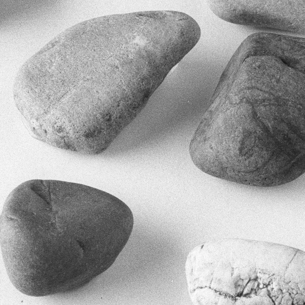
The view up close