Welcome to post two in my blog series introducing tone in black and white photography. If you haven't already done so, you might want to check out the first instalment. You can navigate to it using the menu on the right or the search box above it.
Here's today's instalment.
A sliding scale of grey
Imagine a continuous line of tone that stretches from black, through every conceivable grey, and arrives at pure white (which is often in practice simply the ‘colour’ of our paper, minus tone). We can make a visual representation of this using software:
From black to white - an imaginary line of every tone
Photographs can be made up of predominantly one tone, e.g. very dark grey, or they can contain a staggeringly wide range. There is no a priori rule that says photographs must contain certain tones, where on this scale tones must come from, and in what combination they should be seen. However, we do have a good deal of precedent regarding what works well in a given situation. As ever in art practice, rules of aesthetics can sometimes be broken.
The scale above hints at an infinite scale of grey, at least theoretically. This tells us of the beauty and flexibility of black and white. It is an incredibly subtle medium, which looks deceptively simple. I liken this for my students to the keys on a piano. You can ‘get’ that they produce a series of notes, even if you are not a musician, but making actual music from them - putting them together in a certain order, with the right timing - is something else. In isolation tones are as characterless as a single note, but in combination they are there to be ‘played’ and made to sing.
Now, it is not very practical to refer all the time to an infinite scale of grey, even if that is what an analogue medium can potentially produce. So in photography it is customary to divide the tones into a series of ‘zones’ that are a stand-in for more subtle and complex groupings. The zones help us to specify the areas of tone we mean, and perhaps more importantly can be related to the practical business of exposure. Exposure is essentially how light or dark our image turns out, and is determined by the amount of light we ‘expose’ our film or sensors to.
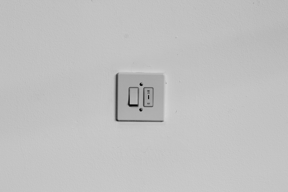
Let’s do this practically. Were I to point my camera at a white wall and let the meter determine the exposure settings I would get something like this:
Let us say, for the sake of argument, this is 1/250, f11 at ISO 400. (If you don’t know what these numbers mean, now is the time to look them up, or make a mental note that you need to come back to them in a little while.) You will observe that the tone I’ve created in my photograph is in the middle of the range. This is because light meters in cameras are calibrated to produce a ‘middle grey’ (there are some nuances and complexities to this, complicated by contemporary metering systems, but that is for another article).
So let’s say I am unhappy with this result and want my photo to look more like a white wall. I can do this by adding more exposure:
I used the same settings as above, but this time changed my aperture to f5.6. That’s two stops more light entering my camera, and two stops up the scale of zones. Sometimes this is referred to as ‘over exposure’ (i.e. too much exposure), but I hesitate because I’m preaching that there is no absolute right or wrong in this. If you want your wall to look this way, this is the exposure you choose.
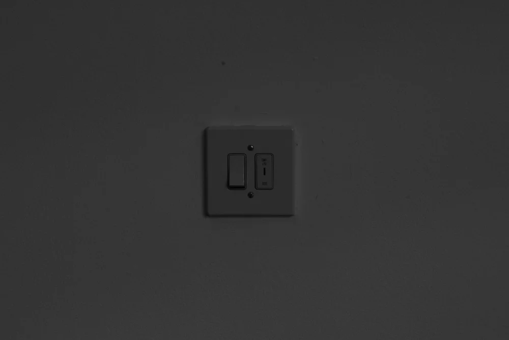
Let’s now complete the set and produce a dark version:
This time I changed my aperture to f22. My world has gotten darker, the mood is more ominous.
While the example of the wall shot underlines the direct relationship between tone and exposure, it is an undeniably simple case. It’s not quite true that we are dealing here with single tones that equate to zones, because the images will actually be made up of some quite subtle fluctuations of grey within a zone region. However, you will see that we can use the zones as a useful way to categorise our shots, in which groups of tone do indeed dominate. We can put this is in an even simpler way by using the more common categories of shadows, midtones and highlights. You may have come across these in software (e.g. Adobe camera RAW, or Lightroom), or in general discussions of photography.
Next instalment: contrast & dodging and burning


