Games to play
Welcome to the final post of my Tone: A Primer series.
Today I’m going to look at some exercises you can do in order to sharpen your command of tone in black and white. They are suggestions and starting points and can be modified to suit your own practice and equipment. I have endeavoured to ensure that there is material for both film and digital users, although the final exercise is a film one. They are given broadly in order of difficulty.
1. Play with exposure
If you are relatively new to photography, it is well worth beginning with a simple exposure exercise. Try reproducing the modest exercise I explain in post two (under the heading ‘A sliding scale of grey’). Easy to do, but insightful if you are starting out. You are in control of the tones in your images.
2. Shoot black and white things
I have Jevon Tooth to thank for this exercise. When Jevon showed me some of his great black and white prints, it was obvious that he had deliberately targeted black and white objects in order to hone his vision in the medium (e.g. some very lightly toned grasses against a painted black fence). The thought had never occurred to me! A simple but very effective to way get a sense of how black and white tonality can work in crafting images.
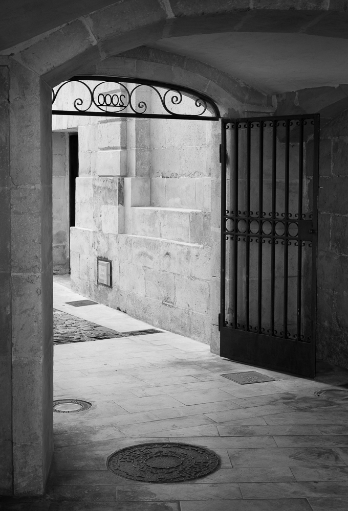
3. Strive for tonal variation
For this exercise, I’d like you to prepare and print an image that contains different areas of clearly distinguished tone. Whether you are working with digital or darkroom, the task is to use dodging and burning (or equivalent tools) to help separate distinct zones within the image, and to use this to draw the viewer’s attention to the main subject.
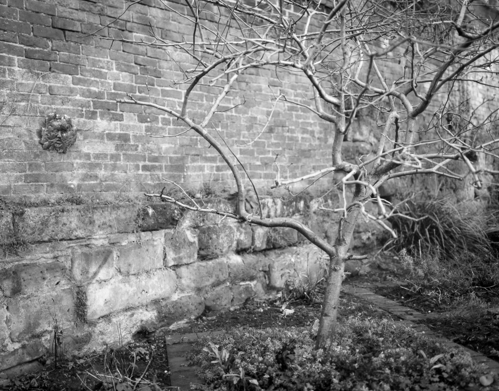
A warmtone darkroom print showing careful modulation of tone, with a strong main subject that is tonally distinct from its environment.
Traditionally, this involves keeping the subject (especially if a person) fairly light tonally (this catches the eye) and to darken surrounding areas, particularly edges, so as to create a frame. Darkened edges are known as a vignette.
Yet further than this, it is important to make decisions about how to create a sense of contrast between the image zones. Perhaps a very light area of window light needs to burnt-in just a tad, so as to lend a little more solidity to it. Maybe an area at the end of a road in a landscape needs lightening to distinguish it from surrounding trees and to lead the viewer’s eye through the image. Perhaps a little collection of objects near the bottom of the frame is too light and competes with the subject that is more central. Knock it back with a gentle burn-in.
4. Shoot the zones
This exercise was devised by John Blakemore. It assumes some familiarity with the zone system, or, at least with the tones that are demarcated by it. Summaries of the zones and their corresponding descriptions abound on the internet, so one of these is a good place to start.
You begin by choosing a zone and attempt to make a photograph that encapsulates its mood. So, I might choose zone four, say, looking carefully at the tone given in the charts and mulling over the description I have found of ‘average dark foliage, dark stone, landscape shadow’.
The challenge with this exercise - and a challenge it indeed is - is that you are trying to make an image that still holds a range of tones, but that somehow summarises the feeling of the zone in question. You may of course use any development or printing controls you have at your disposal to make the print that you think is appropriate. There is no right or wrong to this, it’s simply a very good exercise for understanding the tonal range available to black and white photographers.

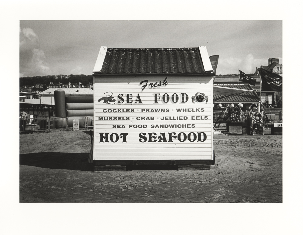
Excepting some of the lighter areas, in particular the cottage, this image strikes me as having something of a zone three / four mood.
5. Make a ring-around
For this exercise I’m going to assume that you are using a film (and developer) with some regularity, and that you have a pretty well-established development regime.
You will need to shoot three rolls of film. Firstly, shoot your typical subjects at ‘box speed’ (i.e. the ISO as stated on the film box). For example, if you are shooting HP5+, you would go with 400. It does help to have one or two test subjects (e.g. a given room with consistent lighting) that will provide a reference point across the films.
Next, you shoot more of your typical subjects (re-do that test subject too) but this time at a stop under and a stop over that box speed. You might simply want to change the ISO on your camera, so that you can simply get on with shooting. Therefore, in my 400 speed example, I would shoot some frames at 800 and some at 200. It takes some discipline, but it’s really worth making note of all your exposures as you do this exercise.
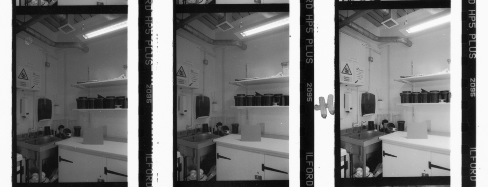
When the films are finished you then develop them in the following way. For the first you follow the manufacturer’s guidelines for the developer in question. Opening up my box of HP5+ I find a handy chart which will tell me the time with the developer I'm using. For the next film you add 20 percent to the development time, so as to ‘over-develop’ the film. You may have guessed that for the remaining film you are going to reduce the original manufacturer’s time by 20 percent. This will give you ‘under-development’.
When you are done developing you make a contact print of the results, in your usual manner. In the following image you can see just such a contact print, here showing the ‘normal’ development, and what is labelled +1 and -1, meaning our +20 and -20 percent. I have asked you to do a lot of hard work so far, but already you have a lot of really interesting information. Do you prefer the manufacturer’s development time, or the over- or under-developed version?
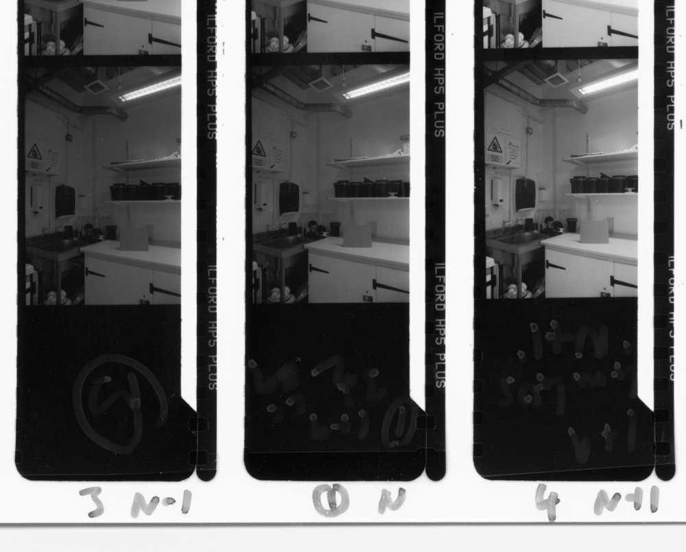
Contact print showing 'normal' development (centre), under-development (left) and over-development (right)
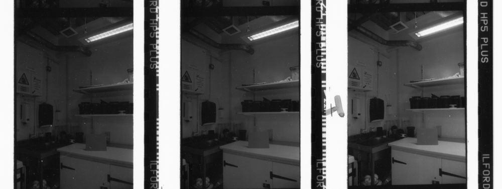
Next you can look for frames that you overexposed. What do you think of overexposure and underdevelopment? Or of overexposure and overdevelopment? Which tonality do you prefer? Here is my contact print showing overexposure. The development sequence is the same as the image above, so left under, middle normal and right over.
The underexposed frames then complete the picture. Again, which is the best tonality, for you and your typical subjects? What does the test scene suggest?
There is some more work to do, because this exercise can be brought to a brilliant conclusion. The last step is to print a selection of the images (logically you’d do nine, as suggested by the contact prints above) aiming for the best possible print in each case. In other words, you don’t print them all to some standardised time and grade, but make the best possible print using all the usual controls that are available to you.
You now have a huge amount of information about your shooting and developing regime and with luck some interesting new exposure and development settings to trial over a longer period. You are not stuck with whole stops or indeed 20 percent, but can make further refinements as you progress. Not a quick or easy exercise but potentially a very fruitful one.