“Photography helps people to see.”
Follow me on Twitter
Follow @richard_pickup to see what I'm up to on Twitter. It's a great way to find new content about photography and to connect with lots of interesting photography folks.

Sand Patterns shot on Ilford XP2 Super film
Sand Patterns
Sand and the patterns it creates have a special draw for photographers.
This one is shot on Ilford XP2 Super film and scanned on a Nikon Coolscan film scanner. I processed it in Lightroom, cropping away a fairly substantial area on the right before tweaking the tonal balance. I enjoy how the light catches the sand, creating little sparkling patches, as well as the more obvious and graphic patterns.
The shot was taken at dusk on the beach at Weston-super-Mare. I had taken my son out for a little walk and we played on the soft white sand. The light was very beautiful and we were both quite content in the cool evening, a little moment of peace. Maybe it is the reading I've done about space where sand always seems to crop up in star counting analogies, but I can't help but feel there is something profound about these glassy grains. It puts me in mind of the elemental processes that shaped our planet.

A Batis and a bear
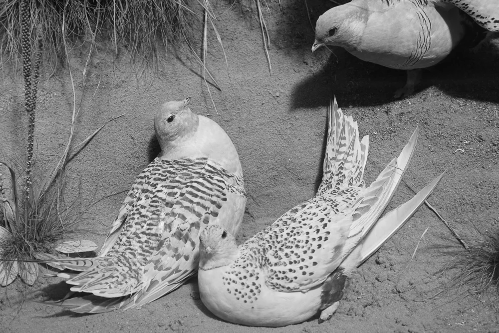
I have been lucky enough to try out the new Zeiss Batis 85mm lens for Sony FE mount in recent weeks, and the other day it accompanied me on a trip to the Natural History Museum in Oxford. This seemed like a good occasion to use the Batis with some purpose and also to organise my thoughts on the lens so far.
The Natural History Museum is a fine place to explore photographically. They have a relaxed and inclusive approach to their audience (photographing is not frowned upon as in so many venues now; they provide portable chairs so as to allow folks to sketch the collections; there is no entry fee), and light streams in from the fabulously ornate iron-clad roof. A stunning collection of specimens, including huge dinosaur skeletons and all kinds of stuffed animals, positively begs for a monochrome treatment. (This may just be me though: I can’t get the fabulous scene from the museum in Chris Marker’s film The Jetty out of my mind. Well worth checking out if you don’t know it, as it is made up of a sequence of beautiful stills put together to feel like a movie.)
As is now well known in the industry, Zeiss has been putting considerable resources into its partnership with Sony and has produced some much lauded lenses for the Sony A7 camera range. I have used the Sony / Zeiss branded 55mm f1.8 quite extensively and it is a superb lens; small, light, built like a tank, and sharp wide open but still full of character (I evidently have a thing for Sonnar designs, see a previous post).
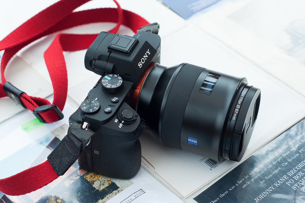
I was in for something of a culture shock when I attached the new Batis 85mm to my mirrorless A7 Mark II. It is not so much a heavy lens (at 475g), as a bulbous one. Immediately one begins to question whether the whole ethos of the mirrorless format has been compromised by adding such a form - inevitably this makes the setup seem much more DSLR-like. My take on this is that there is still a considerable advantage in size and weight over DSLR equivalents, although I expect some will see this differently. I am in the process of investigating 85mm as a focal length, and so cannot say definitively whether I am committed to it yet. I suspect that if I adopt 85mm fully, I could be quite happy accommodating a lens that is a little more bulky than I would like, especially if the results warrant it.

The sun streamed in as I walked around the Museum and set about the task of putting the Batis through its paces. I attached the lens hood to guard against flare, something which approximately doubles the size of the lens. With my camera strap wrapped around my wrist, I could easily hold the A7II in one hand. When shooting, my left hand had a good deal to hold onto, making the whole setup feel very balanced, and this despite the fact that the camera is visually dwarfed by the lens. The Batis has a sleek and smooth shape with very comfortable ergonomics. It has a rubber focus ring which I really enjoyed using for fine focussing.

This is hardly a full and scientific lens review, however I did endeavour to use a range of apertures in typical shooting situations. The Batis is arguably designed as a portrait lens and f1.8 at close distances produces very smooth out of focus areas and gives nothing away in terms of sharpness at the centre. This is clearly an area where modern lenses now excel: the old advice to stop down an aperture or two to achieve full sharpness is less and less relevant (although generally one will have to pay for this privilege, and the Batis is not a budget lens).
Utilising the reach of the 85mm and engaging middle apertures brings sharpness across the frame, as one would expect. I noticed some difference in critical sharpness between f9 and f11, so I would be inclined to use f9 as a limit for bigger prints. As ever, there are a number of variables at play here, so I do reserve judgment on this pending further tests and more accurate data. As ever, I found the viewfinder zoom facility on the A7II along with manual focussing to be a boon for getting focus spot on.

Examining my images from the Museum on Lightroom, it was immediately clear that this is a lens with significant edge distortion. Happily, Lightroom has a corrective profile, and so this is not an issue for me. I know that some people object to such apparent flaws in what is after all a high quality prime; my understanding is that lens designers work with a series of trade-offs to produce the qualities they desire for a specific lens. This is a lens with a distinctive (and to my eye pleasant) character, and as I have already mentioned the designers clearly have people shots in mind. I have made a very beautiful colour print of my son using Hahnemuhle Photorag paper, which clearly show the strengths of this lens for portraiture. If I didn’t already own some top class portrait lenses, I would surely invest in a Batis for this alone.
In summary, this is a very high quality metal lens which feels robust and has sound ergonomics. While my imagination gravitated towards black and white for my Museum trip, the Batis has a notably ‘Zeiss’ colour signature, with humming blues and intense reddish browns. At f1.8 the lens is already very sharp, and it produces sumptuous out of focus areas. The tonal transitions it produces are attractive to my eye, and while this may be entirely subjective, a little more analog-looking than those produced by some lenses for digital. This is a thoroughly modern lens with some traditional mores: when the camera is switched on a luxurious black and white LED glows a proud ‘ZEISS’, before displaying very accurate depth of field information. A boon to some users I’m sure, but perhaps not me.
As I mentioned above, I am still in the process of investigating the 85mm focal length. What I do now know is that if I settle on it, I will be very hard-pressed to give up the Batis. In any event, I for one am happy to see such a lens being added to the ever increasing options for Sony mirrorless.

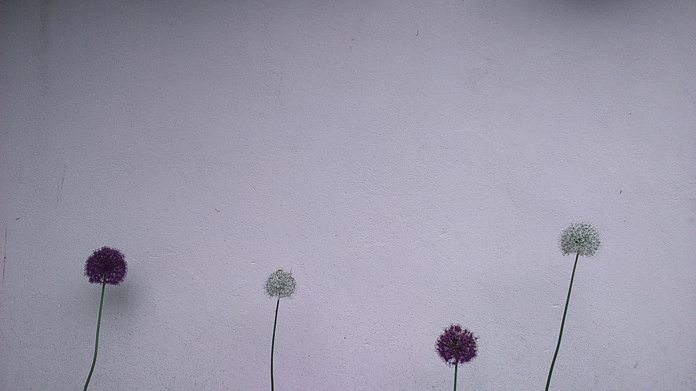
Alliums against a Wall. The finished image after processing. Made with a Sony Experia smartphone.
Alliums against a wall
I did a little smartphone photography the other day.
The original file was in colour. I imported it into Lightroom, converted it to black and white, and cropped it to a more agreeable shape. I then spent a bit of time working on the tones, ensuring that the alliums stood out against the background. I used mainly the basic sliders in the develop module, along with some neutral density filters to even out the tones. This was the biggest challenge because the original has some subtle but visible shadows and I wanted to neutralise them somewhat. A useful tip is to squint to see if the tone works. You can also try standing back from the screen to see if anything looks uneven.
I've included the original shot below so that you can get a sense of the processing. It's wonderful to have such smartphone technology. It was one of those occasions where I was without a camera, on my way to an appointment, and just happened to spot the wall. Having my mobile with me gave me the option to exercise my creativity and see if my visualisation of the black and white image would work.
The original file before processing.

Road in the Rain by Kate Kirkwood. Kate's image is full of high ISO noise, anathema of camera testing websites, but the excellent concept and execution easily trump that.
Image by kind permission, copyright Kate Kirkwood.
The good will out
Have you ever worried about sharpness in your images? A cursory look at internet photography talk confirms that a lot of folks most certainly do. How about chromatic aberration? Or the edge distortion in your lens? Is your lens sharp at the edges of the frame? Such questions multiply and are often conflated with ‘quality’ in photography.
I write ‘conflated’ because we can quite rightly ask ‘is quality exclusively the product of a series of technical concerns?’ A great antidote to such contemporary obsessions is the pantheon of photographic images itself. How many of them would stand up to the scrutiny of modern standards? I strongly suspect that a good many of them would fall down on one aspect or another. This leads to the true antidote and the point of my post: a ‘good’ image may possess flaws, technical or otherwise, but we forgive it because it is good.
What might it possess that makes an image good? Incredible timing, elegant composition, cutting observation, emotional resonance, beautiful light … The list, which goes on, inevitably has its subjective element, but I think we can and should try to say what specific strengths a given image has. My instinct is that often it is a special combination of parts that makes an image stand the test of time. To paraphrase a teacher of mine, the best photos stand up to and reward repeated viewings. Their gifts do not easily run out, and we often discover something new when we return. In a sense, their ability to offer something to us outstrips our capacity to exhaust them at a given time.
However we agree to define them, there is considerable agreement that ‘good’ images are there. Their existence and our enjoyment in looking at them should provide the perfect antidote to our technical obsessions and insecurities. For great photographs were made, frankly, with inadequate, broken, or sometimes simply the wrong gear. Technique was less than flawless. Yet in some indefinable combination of elements, hinted at above, superb work was done.
So what’s stopping you forgiving some aspects of your work and allowing the good to trump the technical?
*See more of Kate Kirkwood's great work at katekirkwood.com (click the image above for a direct link)
* Footnote to previous post: screen vs paper
Whilst looking at my previous post I had a realisation. There is a world of difference between the on-screen version of my Shutters image and the version on paper. I have to rely on the reader imagining differences between papers because the screen and the paper versions are so very different. The 'light turqouise' patch of which I write literally can't be represented on screen. A problem on one level, but, an inherent part of these distinct media and a splendid example of the gap between screen and print.
I guess you just have to see the prints too.

Shutters printed on Hahnemuhle Bamboo paper. Shot taken in Chandigarh, India
Unseen creative opportunities
Consider the process you use to make photographs. Consider the things you do and the parts you control as you pursue your creativity. Perhaps you think a great deal about composition. Perhaps you enjoy vivid colours, or are obsessed with portraiture. Maybe you print your images on a favourite paper. Perhaps you go as far as mounting and framing them to enjoy on the wall or give as gifts.
Now, let me put to you my theory: there are opportunities for being creative in your process that you are not yet aware of.
This is something of a truism perhaps (i.e. it always applies to all our work), but it is something worth pausing to consider. We so often get a little stuck with our photography, coming to see it in a particular way, and as the product of certain equipment, subjects and techniques. It is refreshing photographically and creatively to realise that there are other things we could be engaging with, other aspects from which to derive artistic pleasure and satisfaction.
Let me give you some concrete examples. I have gone through many different combinations of film and developer, but there was a time when I had decided to concentrate on a particular combination. This affords a significant advantage which I actively sought at the time, namely the ability to play with exposure knowing that development was standardised and thus variables kept to a minimum. It is both one of the joys and frustrations of photography that it always encompasses a process of several elements working upon each other. It is quite hard to concentrate on a particular thing (e.g. printing) at the exclusion of others (e.g. shooting) because the sum of the parts is always in effect (e.g. the print affected by the exposed negative).
At some point in the future I began to leave my (wholly justified and productive) frugality and rediscovered the joys of using films and developers promiscuously. This reinvigorated what I was doing creatively because the characteristics of the resultant prints suggested new ways to interpret my existing subjects, or indeed drew me to subjects I had not yet considered. Something that I knew at the back of my mind - that film and developer choice was a creative choice - became an active and useful part of my image making. I am still today exploring the ramifications of this creatively.
Here's another example, this time from my digital printing work. I had made a print of some shutters in India on Baryta paper that I was quite content with. I had printed it at different sizes and settled for a smallish print on A4. Colour is integral to the piece, and I had carefully processed it to evoke the vibrant oranges and browns but not to the point of clear saturation (India hardly needs excesses of processing). Having experimented somewhat at the start and being content, it never occurred to me that I might be able to improve it.
One day, I came across a description of Hahnemuhle Bamboo paper on the manufacturer's website that mentioned the synergy of the this paper with subjects containing orange (or so says my memory, the exact phrase may have been a little different). I half-heartedly reprinted my image on Bamboo without any expectations and was delighted with the result. The oranges were indeed lifted without losing their realism, but the revelation for me was the top right of the print and a little very light turquoise patch. This area now positively sung, and entered into a different and satisfyingly complementary relationship with the oranges and browns. A modest aspect of the overall effect perhaps, but crucially one that suggested to me a significant new creative area in which to explore. Paper had colour. Paper choice was a creative choice, and something that might inform my visualising an image.
In conclusion, I direct you again to your typical making process. You capture, process, maybe share or maybe print, be it film or digital. Each stage of the process holds a wealth of unseen creative possibilities. You know at the back of your mind they are there, but you haven’t yet set them to use. Consider a different film. Explore a new photoshop plugin or film simulation pack. Change your developer. Print on some new paper. Arrange images in combination. What do the changes do for your work? Do they suggest a new way of working? Or a totally new subject matter?
Seek out your unseen creative opportunities.

My trusty M series Leica, pictured with Zeiss Sonnar 50mm. Paint damage to the Leica lettering was sustained in the heat of India
If I could only keep one camera ... a post about my M6TTL
My Leica M6TTL has become central to my photography over the last couple of years. I have recently begun to reflect on what I value about this camera, partly through writing about photography, and partly through my restless experimenting with different cameras and formats. Why, I’ve asked myself, does this camera endure? Proclamations of love for a specific piece of kit or format may be doomed to later contradiction, but it is very tempting to say that if I could only keep and use but one camera it might well be this, 50mm lens attached.
I remember picking up the M6TTL for the first time: it was much heavier than I expected. It is not unusual for people to have this experience when picking up Leicas for the first time - they look small but are surprisingly solid and hefty. Leicas are handmade tools and are built to last. I bought mine second-hand, very lightly used; I believe it dates from the turn of the new millennium. I remember it being cold and resolutely machine-like. Having used a largely plastic DSLR (along with some compact cameras) for some time, this was something of a shock.
I had read a great deal about the famous ergonomics and design of the Leica, but I can’t say it felt luxurious in my hands. I did notice how smooth the wind-on lever was and the shutter press felt ‘silky’, if somewhat recessed. I had used quasi-rangefinder cameras before: I played briefly with a Zorkii to study the design and shooting method, and I had used a diminutive Ricoh GR1s for many years (not a rangefinder of course, but, having a finder unconnected to the lens, unlike an SLR). I found that the design and operation of the Leica is quite distinct. I wouldn’t advise anybody to try out a ‘budget’ rangefinder to see if they may like a Leica. There isn’t enough information there and it can therefore be a false economy.
The pictures I first made with the Leica were impressively sharp. As a result, printing the negatives in the darkroom yielded a clear and much-appreciated lift in the quality of my prints. There are various theories as to why Leica cameras yield this advantage. The most obvious one is the lack of a reflex mirror. Only the cloth shutter is at work when the picture taken and thus the camera subject to fewer vibrations. Another is that the form and heft of the camera, often pressed to one’s face for extra support, allows one to press the shutter with a very gentle squeeze. I soon followed the Leica crowd and installed a soft release in my camera’s shutter button. I do believe this facilitates a more gentle and responsive shutter press. The winder also allows one to install one’s thumb behind it as one presses. This I believe is a reason why people install ‘thumbs-up’ metal supports into the hotshoe of digital Leicas.
The other thing that strikes you straight away is the finder. (I should say for completeness that I write about 50mm framelines on a 0.72 viewfinder magnification. This is significant technically because other focal lengths, finders, and cameras won’t give you the same view). The framelines sit within a wider frame. Photographing, one has the sensation of isolating ‘pictures’ in a bigger continuum of the world. I have written elsewhere about the effect and it’s something I really enjoy. As I look at the frame I can visualise my image as a picture (print) separated out from what is around it, but I still have the information of what is outside the frame. Some people particularly like being able to see things before they enter the frame, but it’s not so much this as the feeling of looking at a picture that I enjoy (and indeed, that I miss terribly on my digital mirrorless camera).
I started using my Leica for candid portraits as soon as I had it. Looking back on these early days, I see some of my favourite people images, and cannot help but think that the Leica raised my game. This may be nothing more than a subconscious owner’s pride, or an attempt to live up to the famous marque. After all, as Roger Hicks has pointed out, you hardly have any excuse for your poor photography when shooting with a Leica. I don’t believe it is this (or just this): I think the process of manually setting aperture and shutter speed, of conscious pre-focussing, of the need to imagine depth of field and indeed the film emulsion (in short, properly to visualise the result), leads to more careful and perhaps more memorable shots. Maybe it is the gap between taking and seeing an image with film that leads me to remember more vividly my film shots, but I think the care that the Leica demands seems to play a part too.
Leicas are not intimidating cameras to point at your subjects. I found that my regular family muses soon started to ignore the little M6TTL and went about their business, just as I like from a photographer’s point of view. Leicas are quiet, to the extent that subjects are hardly aware when a picture is taken. As we all know, this is a blessing because of the ‘acting up’ effect of so many initial encounters with a conspicuous camera and shutter.
So I return in conclusion to my original question about why the M6TTL has endured, for me. It is a well-made, hard wearing, quiet, unassuming camera that demands manual control and close attention to aperture, shutter speed, depth of field and timing. It offers a view peculiar to it (although we could speak of different views imposed by digital cameras and advantages therein) and encourages visualisation. Technical quality, when employed properly, is superb (there is a case for saying second to none with 35mm film, notwithstanding the role of different lenses and other factors). I know that the fact that I shoot film is of importance to me and surely a factor in my regard for the M6TTL.
My preferences are my preferences, they may not be yours. If, however, the factors mentioned above are important to you, or even spark your interest (and you haven’t yet tried this camera or something very like it), then a very interesting journey may well await you. Maybe a Leica M6TTL will turn out to be your ‘one camera choice’ too.

Out now on Emulsive
I have a new article on Emulsive.org about the process of visualising when shooting film. It's called 'Visualisation for Film Photographers'.
Emulsive is a rapidly growing site dedicated to exploring film photography in its many guises. It is run with energy, humour and genuine community spirit. There are a lot of interesting photographers to check out, as well as pieces on equipment and processes. They are also looking for contributors, and so offer a great way to get involved with like-minded folk who are passionate about film.
Click the image above for the link.
Abell on composition
“My Dad had been an ardent amateur photographer, and he taught me to compose a photograph from the back to the front, and then populate the picture.”
The print as teacher
When I began printing in earnest in the darkroom I was immediately aware of a problem. I hadn’t seen too many actual prints by established darkroom workers. I knew this was an issue because of the problem of ‘calibration’; of being in a position to aim (or indeed not aim) for a known outcome. As I began to work, I soon saw incremental improvements in my practice (I could make sharper prints, I had better command of tone, I started to become aware of the notion of a ‘good’ negative that prints easily), but I still had a nagging feeling of not knowing how exactly to quantify the work. I work happily on my own and am a contented autodidact. I embrace the idea that I am always learning. But the thing is you do sometimes need a yardstick.
I shall not burden this post with the ins and outs of what prints, silver or digital, I saw, or acquired, or when. Suffice it to say that looking back from a position of having become acquainted with top class prints, the benefits are glaringly obvious. The advice of this post is to endeavour with whatever means at your disposal to learn from fine prints. For example, here in the West Midlands, Birmingham Library has a superb photography archive. You can make an appointment and see real prints by such esteemed printers as John Blakemore. They will offer both work prints and finished ones, and you get the chance to study the printing decisions made and how the artist has attuned the final print. Other photographers, especially these days through online media, offer relatively inexpensive inkjet prints that are finished to extremely high standards. And that is not even to mention exhibitions of photography (although I do find these less useful because of the inability to study over a longer period).
By studying prints by others you have the opportunity to ‘program’ your visual memory and bring subtle relationships of tone, framing, sharpening, cloning and other enhancements to your own work. You construct a multi-faceted yardstick in your mind to which you can refer in differing print situations. The print is an invaluable teacher indeed.

XP2 Super film by Ilford in action
In praise of XP2 Super film
Somebody asked me the other day 'what film is in your camera right now'. I answered XP2 Super, and called it one of my favourites. Why?
If you are unfamiliar with film, I can begin with a recommendation: try XP2 because it's easy to use. There's an argument along these lines for all 'medium' speed films of course (400 ISO), film having a notorious 'latitude' (meaning that even under- or over-exposed frames will print to some degree of use). XP2 is especially forgiving, it absorbs extreme highlights and reproduces them as kind light greys rather than blocked-up paper whites. Indeed, XP2 thrives on generous exposure; one of its other qualities being that the grain appears most pronounced in the shadows - the reverse of traditional emulsions like HP5 plus.
To ease of use we can add convenience. XP2 is processed using colour chemistry, something that you can still find in many places on the high streets of the UK (though, alas, diminishingly so - kudos to Boots and Frosts chemists in my locale). I am a pretty slow photographer, so my shots build up over time. I really enjoy the fact that I can get a film developed whilst out and about shopping, pick it up a little later, enjoy 6x4inch proof prints, and select which frames to work on in earnest in the darkroom another day. I should add for completeness that I am referring to 35mm, shot in a rangefinder.
Ilford materials are developed to work well together, and I enjoy the look of XP2 printed on Ilford Warmtone Multigrade Fibre Based paper. I want to say that there is a luminosity to XP2 that this paper allows to shine. I strongly suspect that the aforementioned forgiving nature of the film makes for a generally easier ride in the darkroom. Some may read this as a lack of control (developed in colour chemistry, by someone else, remember), but my experience is that even when darkroom controls are limited, they are plentiful.
Scanned XP2, especially when dust reduction or grain suppression software is applied, can look somewhat 'digital', i.e. very clean, almost 'waxy'. The behaviour of the grain mentioned above plays a part here too. If you dig into and lighten those shadows too much unpleasant textures can emerge (of course, all this is subjective, you may want to do that). Economical Leica Monochrom anyone? One could get a second hand Leica M6, a Nikon Coolscan film scanner, a couple of rolls of XP2, and satisfy both digital and darkroom black and white yearnings.
One last thought. Following from my own experience and the wise words of others, begin by rating XP2 Super at 200 for general work (or 400 for low light), but change your camera to 100 when in bright, contrasty light. This allows the shadows to receive adequate exposure, in the face of your camera's light meter which will be compensating for the abundant bright areas. Highlights receive 'too much' exposure using this tactic, but recall that this doesn't matter because XP2 doesn't 'blow out' like digital. This is XP2 Super.

Statue of Liberty, Las Vegas print on Epson Archival Matte paper
Making my Statute of Liberty, Las Vegas print
This print is very much a hybrid of new and old technology. It was shot on Ilford Delta 100 film and scanned and processed digitally before being printed on an Epson R3000 inkjet printer. The film was processed using Ilfosol 3, a developer that works very well with Delta 100, if one wants to emphasise fine detail.
I had made a darkroom print before I went down the digital route. I had envisaged this image as a very crisp and tonally varied one, something that my darkroom print didn’t quite achieve. Admittedly, I hadn’t spent too long on it in the darkroom, and remember filing the work print for further work. I must have been trying out some new ideas in digital processing, because I scanned the negative knowing what was in it and began to work on it in earnest.
One of the joys of modern technology is control. I think the analog darkroom has more than enough control in itself; the digital darkroom multiplies even this much further. The image needed some substantial perspective correction (you can see I am looking up from the camera position) and cropping as a result. I wrestled for a long time with the balance between emphasising the details in the architecture and conveying the grain in a way that I liked. You can’t have it all your own way: enhancing midtone contrast comes at the expense of adding noise to smooth areas. You are forced to protect certain areas (like sky) with carefully made layer masks. I went backwards and forwards for a long time with the tones and detail enhancement. I learnt a great deal about processing along the way.
I hadn’t really considered the print finished until a friend asked me to talk about my work and show some prints. It was at that point that I decided that I had a definitive version, printed on Epson Archival Matte paper. Looking at it on screen and then seeing the print brings a certain surprise. There is a fullness and depth to the print, a ‘rightness’ and balance that you can’t appreciate looking at a screen. It is as if the image can finally breathe. Happily, my first audience greeted the print with a lot of praise. As a photographer you do hope that others will enjoy the aesthetic decisions you make and share and understand a modicum of your vision.
Do you know your lens?
Do you know the difference between f2.8 and f4? How about f9 and f11? I mean, what your lens does to your images, at these and other apertures, in your typical shooting conditions?
If you don't know, I really recommend that you find out. Shooting film is a brilliant way to establish this for yourself because you haven't got the luxury of immediate capture and the temptation to delete and forget. Take your time and set up your camera on a tripod and go through the apertures. On another roll, shoot your typical shots but vary your apertures. I have shot rolls just 'wide open', at my fastest aperture, just to see. Study the results. You will then build up a mental picture of images and variations in aperture that will filter into your shots. Your aperture choice will become more informed and, I hope, your pictures better as a result. Don't worry if you don't shoot film, this works with digital too, but you need the discipline to see it through.

My oddly pristine looking new moleskine notebook. A favourite old technology
Time to crack open a new moleskine

The dinky and venerable Zeiss C Sonnar 50mm lens
Why I love my Carl Zeiss C Sonnar 50mm lens
Scientists today encourage us not speak of magic or miracles, but to wonder at the magic of reality itself. Can a lens be magic? You can see why photographers might be so tempted to see their favourite lenses. Roger Hicks makes no apology for considering magic as a property of a lens, at least in company of other more measurable traits like speed. Perhaps magic is the surplus left over when all measuring has been done, but you still can't put your finger on it. My Carl Zeiss C Sonnar 50mm is magic. For me.