My large format adventures have begun in earnest and I’m starting to build some familiarity with the Intrepid field camera. I have a few observations and feelings to share with you right away, but am working on a more detailed review of the the Intrepid which will be coming soon. If you think you might be interested in taking up large format (LF) photography, or, if you are already into it and are considering buying an Intrepid for its weight advantage, please do check out my review.
The common wisdom on the nature of photographic formats has already taught me very well that I should expect to ‘slow down’ when doing LF. Surely this is true, but I have discovered other concerns in what little time I’ve had with my new camera, and have been given pause to reflect on some interesting considerations.
First, there is the physicality. LF is a physical and tactile operation. I was given good advice to simply learn how the camera works, without worrying about making any pictures. I am impatient too, so make pictures I did, and was aware that there is a great deal to set up when making a LF image.
LF is not something the photographer is going to enter into lightly. There needs to be a very good reason to make an image. You can’t bury a number of cheap shots and ‘fun’ indulgences as you can on a roll of thirty six frames. There’s simply too much time and cost involved, and you are heavily invested in the image you have made. It seems the stakes are very high with LF, but the payoff is substantial if things come together.

Every large format image made will be an investment in time and money. No indulgent test shots here!
Now while my fingers had a great deal to contend with, I quickly learnt my way around the camera and before too long became much more confident. This really is like using a manual 35mm film camera, in the sense that, once learned, your brain goes into a kind of ‘autopilot’ mode, a bit like a driver who stops thinking about gear changes and clutch sequences and simply drives. Hand me any one of my digital cameras, with their formidable menus, and I wager there is something I will have forgotten how to change or access. The re-learning feels continuous with digital because of this.
I think it’s going to be very different with LF. I can hardly claim to have learned all the movements and workflow nuances, but it does fill me with confidence that my investment in effort and time will result in a thoroughly ingrained, automatic, practice. I guess we might say that this is just as well because there is a lot to deal with!
As a 35mm photographer the loss of the ‘image on the fly’ was immediate and obvious. It’s no exaggeration to say that with 35mm I am looking to make pictures all of the time. If an opportunity presents itself, the small camera comes out, does its work in one hundred and twenty-fifth of a second (allowing for a few more seconds of decision making and a pause for the right moment), and is put away. One can be ‘out there’ photographing and go largely unnoticed.
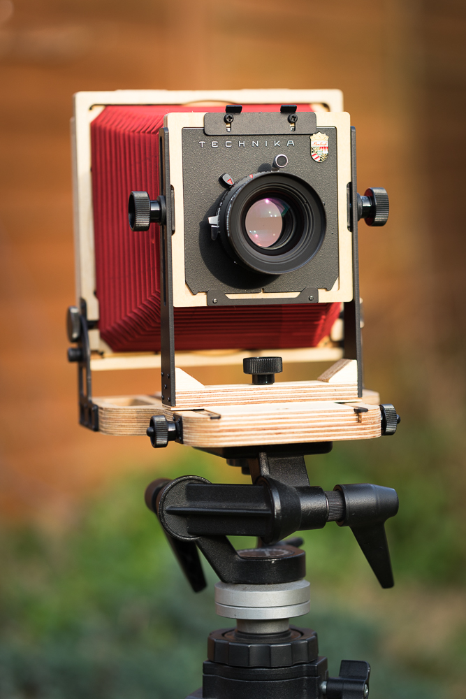
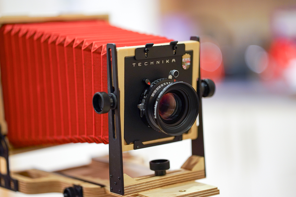
My not-so-discreet Intrepid, complete with red bellows. Not a machine for stealthy street photography.
With LF I am really going to have to want to take an image. I am going to stand there, for some considerable time (hoping my technique is getting more fluid, but certainly not wishing to rush the workflow and get it wrong, and there are so many ways to get it wrong!), with my handsome but attention-grabbing red bellows (did I choose the wrong colour?), standing, senses momentarily muted, under a dark cloth, trying so very hard to concentrate on exposure values, aperture choice, subject movement, and so on. Oh please don’t let anyone try to talk to me! The secluded spot in nature suddenly looks very attractive while I earn my stripes.
And then there is taking LF images of people. I am curious as well as impatient, and there was no way I was going to omit this type of image making from my early experience. Yet it is a curious thing! You are thoroughly shackled by formality, and have to look for an instance where your subject can be ever so slightly natural, in an essentially unnatural situation.
You must place your subject and weigh-up the lighting in the scene. It is actually preferable to scout or adjust your scene before your subject arrives. If light modification needs to happen, it is best done in advance. You are going to have other things to worry about when your subject is in place. So your sitter arrives and you settle on a pose. You carefully survey the image on the ground glass. You have to keep engaging your subject - as any portrait photographer does - as you begin to check your workflow and finalise decisions of exposure, aperture and shutter speed. You make and check focus. You are still talking. Still engaging, showing that you are in control. Then comes that curious moment, the reason I write of a shackling formality.
You insert the film holder and are now working ‘blind’. You have requested your subject to stay in position, but have not yet pressed the cable release. You are faced with a Hobson’s choice: expose too early and risk a wooden pose; leave it too long and your subject will have strayed from the zone of focus and changed your composition. You are in search of a ‘moment’ within a moment. A happening in an ever-so-modest window of time. It is a wonder LF portraits are ever made!
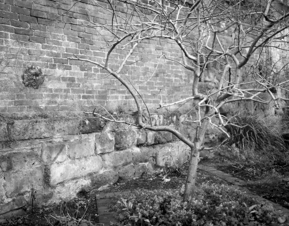
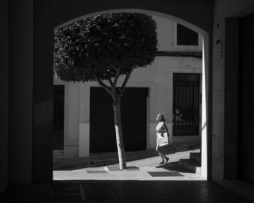
Excuse me if I exaggerate for effect, but I think these observations have a validity and point to real differences in photographic formats (I’m assuming here that medium format is in many ways closer to 35mm than LF as far as the above is concerned). I have naturally made some exposures, and while I have perhaps inevitably made mistakes, I have had some successes too (it is true, LF portraits can be done). I hope to share these and some observations about them in a forthcoming post.
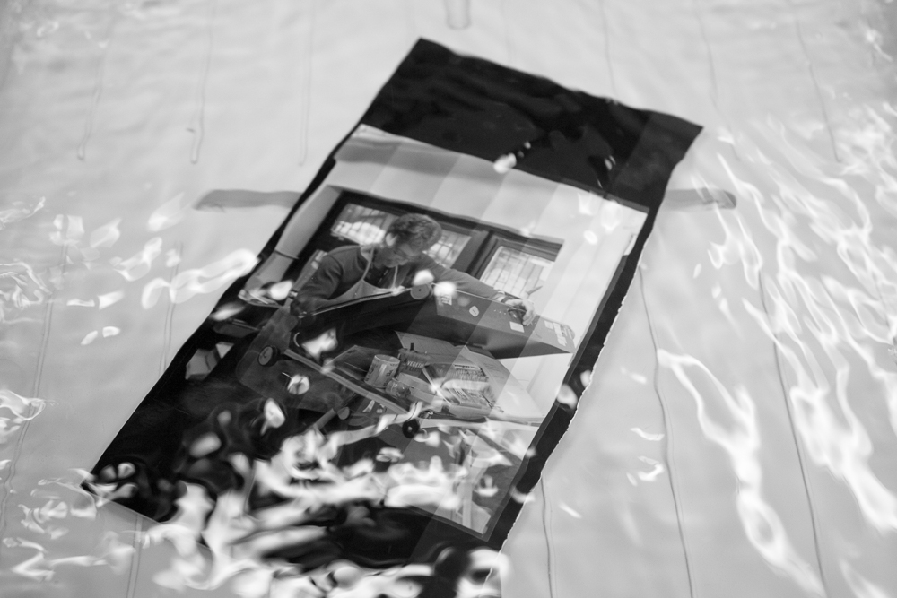
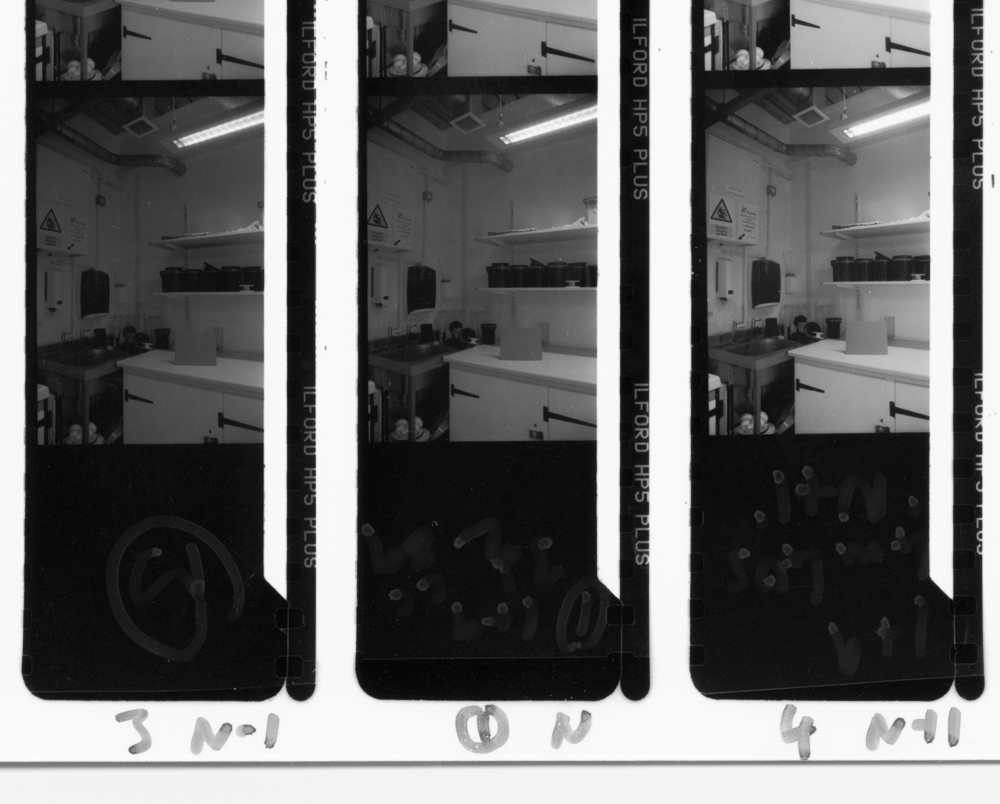
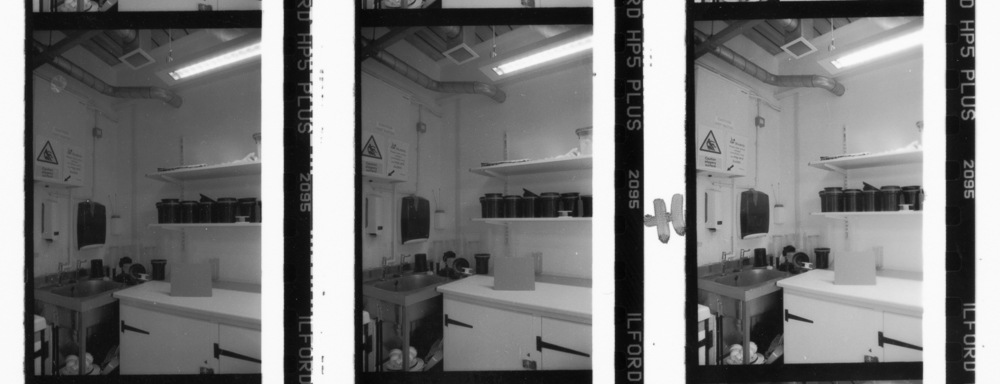
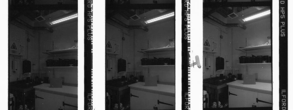
A test strip of my first large format portrait dancing in the wash. This could well be proof that large format portraits can be done.
Watch this space for some more of my adventures with this venerable format.