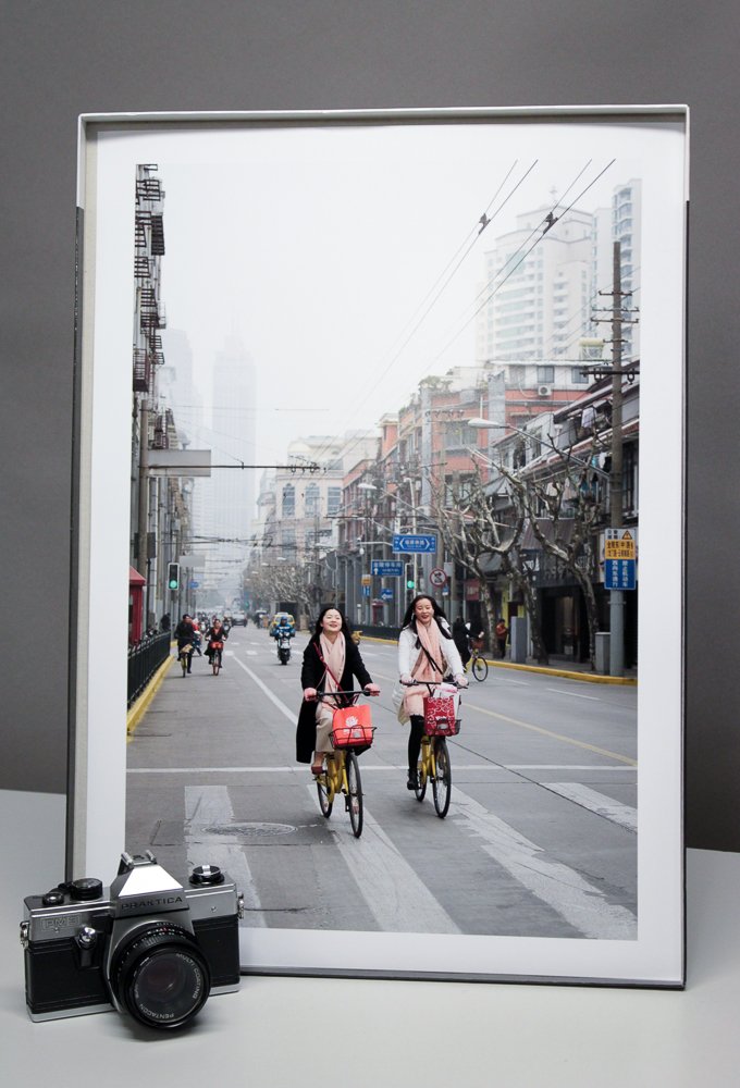
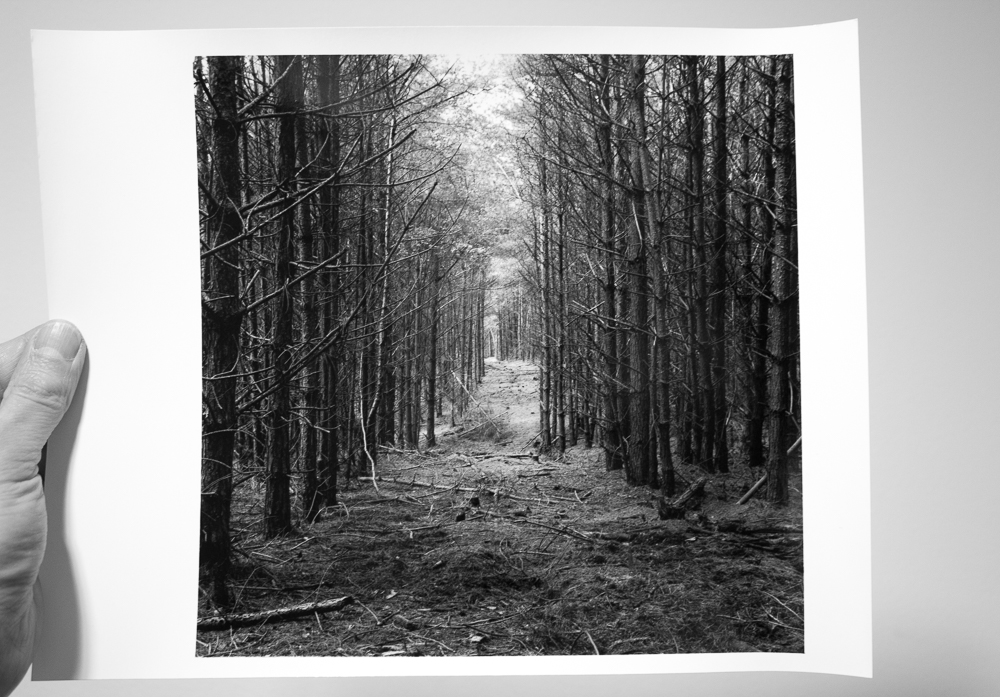
Consider the process you use to make photographs. Consider the things you do and the parts you control as you pursue your creativity. Perhaps you think a great deal about composition. Perhaps you enjoy vivid colours, or are obsessed with portraiture. Maybe you print your images on a favourite paper. Perhaps you go as far as mounting and framing them to enjoy on the wall or give as gifts.
Now, let me put to you my theory: there are opportunities for being creative in your process that you are not yet aware of.
This is something of a truism perhaps (i.e. it always applies to all our work), but it is something worth pausing to consider. We so often get a little stuck with our photography, coming to see it in a particular way, and as the product of certain equipment, subjects and techniques. It is refreshing photographically and creatively to realise that there are other things we could be engaging with, other aspects from which to derive artistic pleasure and satisfaction.
Let me give you some concrete examples. I have gone through many different combinations of film and developer, but there was a time when I had decided to concentrate on a particular combination. This affords a significant advantage which I actively sought at the time, namely the ability to play with exposure knowing that development was standardised and thus variables kept to a minimum. It is both one of the joys and frustrations of photography that it always encompasses a process of several elements working upon each other. It is quite hard to concentrate on a particular thing (e.g. printing) at the exclusion of others (e.g. shooting) because the sum of the parts is always in effect (e.g. the print affected by the exposed negative).
At some point in the future I began to leave my (wholly justified and productive) frugality and rediscovered the joys of using films and developers promiscuously. This reinvigorated what I was doing creatively because the characteristics of the resultant prints suggested new ways to interpret my existing subjects, or indeed drew me to subjects I had not yet considered. Something that I knew at the back of my mind - that film and developer choice was a creative choice - became an active and useful part of my image making. I am still today exploring the ramifications of this creatively.
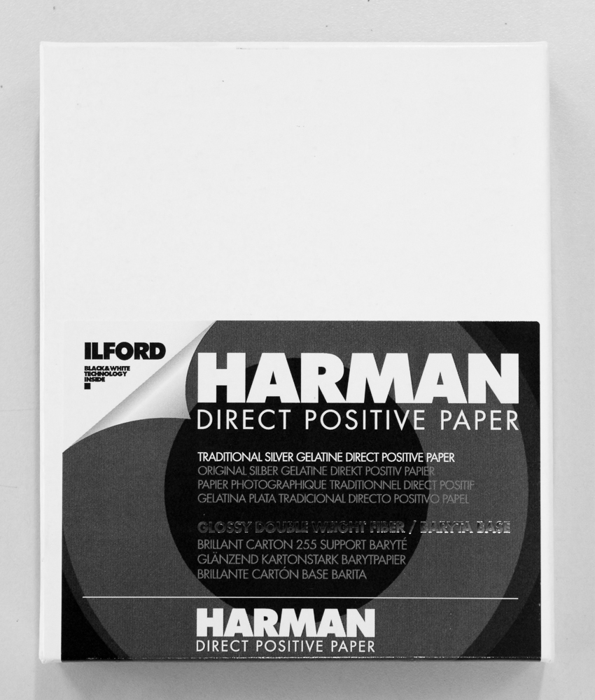
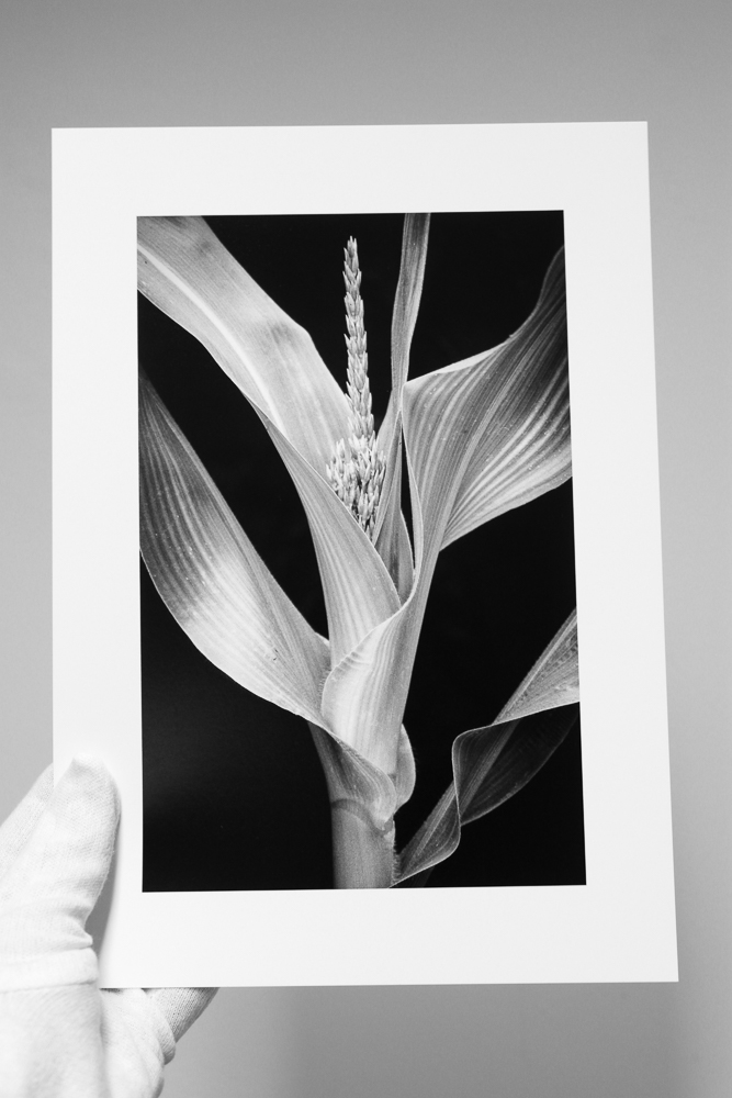
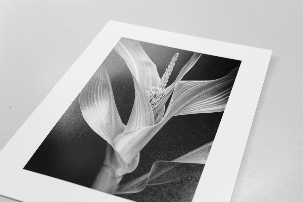
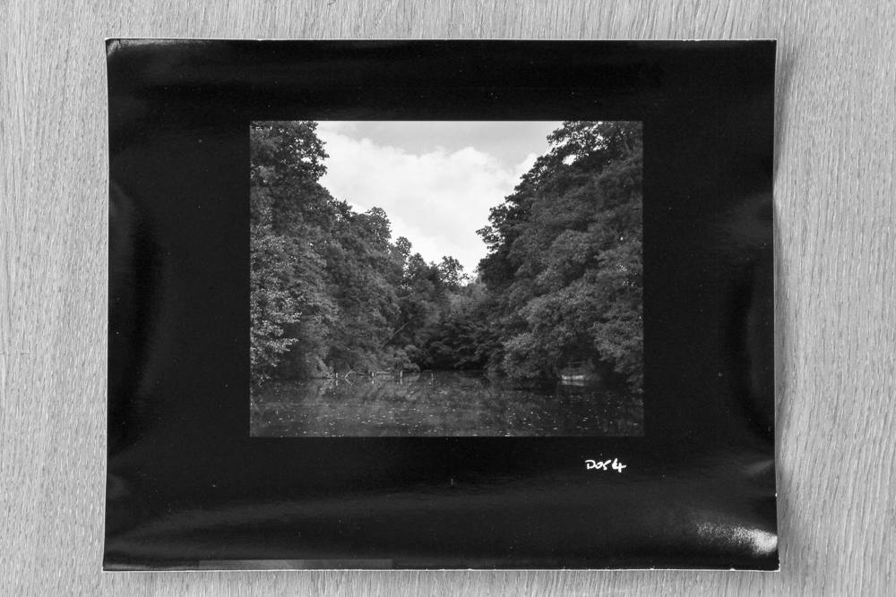
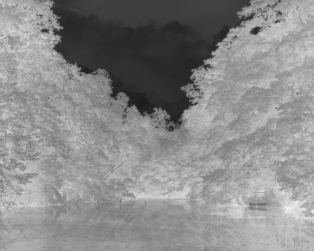
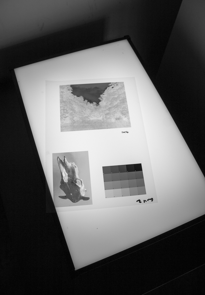
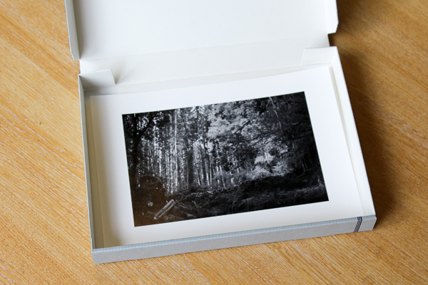
Here's another example, this time from my digital printing work. I had made a print of some shutters in India on Baryta paper that I was quite content with. I had printed it at different sizes and settled for a smallish print on A4. Colour is integral to the piece, and I had carefully processed it to evoke the vibrant oranges and browns but not to the point of clear saturation (India hardly needs excesses of processing). Having experimented somewhat at the start and being content, it never occurred to me that I might be able to improve it.
One day, I came across a description of Hahnemuhle Bamboo paper on the manufacturer's website that mentioned the synergy of the this paper with subjects containing orange (or so says my memory, the exact phrase may have been a little different). I half-heartedly reprinted my image on Bamboo without any expectations and was delighted with the result. The oranges were indeed lifted without losing their realism, but the revelation for me was the top right of the print and a little very light turquoise patch. This area now positively sung, and entered into a different and satisfyingly complementary relationship with the oranges and browns. A modest aspect of the overall effect perhaps, but crucially one that suggested to me a significant new creative area in which to explore. Paper had colour. Paper choice was a creative choice, and something that might inform my visualising an image.
In conclusion, I direct you again to your typical making process. You capture, process, maybe share or maybe print, be it film or digital. Each stage of the process holds a wealth of unseen creative possibilities. You know at the back of your mind they are there, but you haven’t yet set them to use. Consider a different film. Explore a new photoshop plugin or film simulation pack. Change your developer. Print on some new paper. Arrange images in combination. What do the changes do for your work? Do they suggest a new way of working? Or a totally new subject matter?
Seek out your unseen creative opportunities.