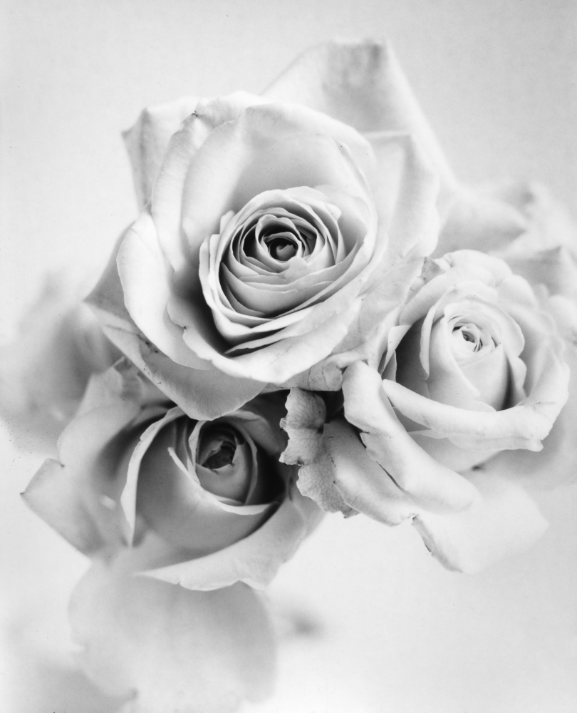
Today I’d like to share a darkroom print with you. It’s a piece that has taken some time to make, thanks to challenges faced at both the capture and printing ends.
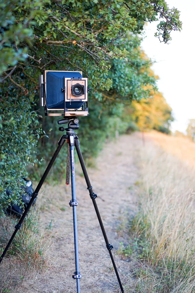
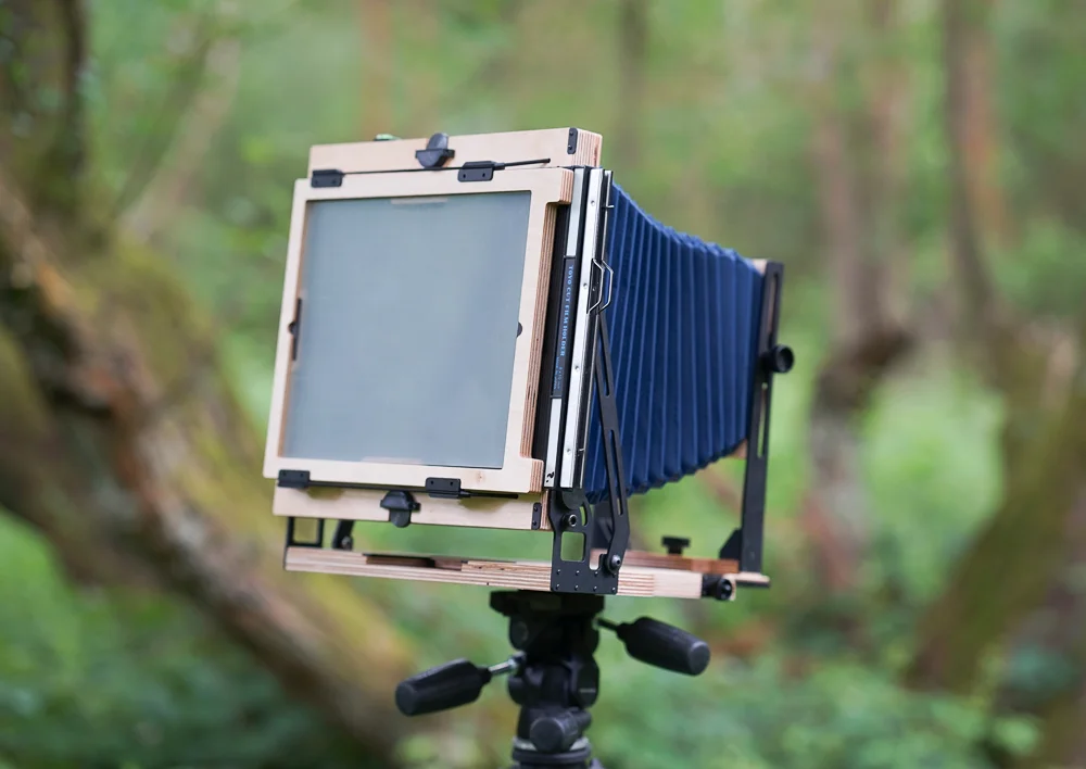
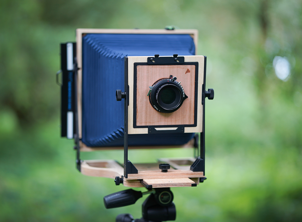
The image is of a somewhat austere or minimalistic still life made with a simple vase, dried flower and table arrangement. It was shot with my Intrepid 5x4 camera on Ilford HP5+ film. I tweaked the arrangement several times before I was happy with it, and pushed my camera and lens to their limits. The focal length of my lens was only just appropriate, and I was asking the Intrepid to behave a little more like a monorail than a field camera.
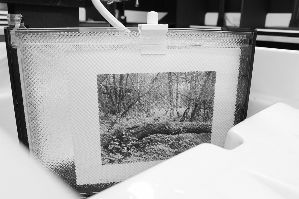
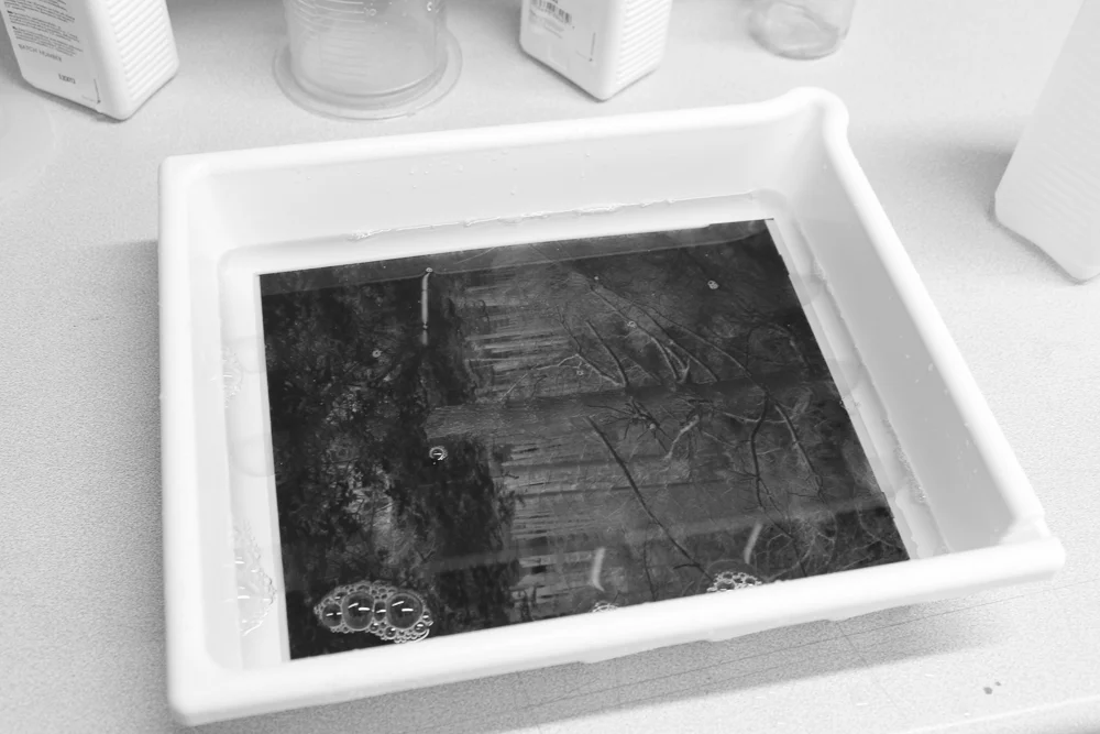
I made two exposures, one roughly at zone VII and one at V (taking the image as a whole). Both are equally good for printing with, although I chose the zone VII one. If you have ever printed large areas of empty tone in a darkroom print, you will know how challenging it can be. The image was not as evenly lit to start with as I would have liked, and then one has to ensure rigorously even development. Any dust on the negative is much more readily evident too.
In my first printing sessions I went down a rabbit warren of burning-in, striving for an even background. The aforementioned problem of uneven lighting made for edges that were too light. Then I had a Eureka moment: this negative might behave much better if I applied a pre-flash first.* I duly followed my idea and the negative printed with relative ease. I was then left to enjoy decisions between a denser print with longer greys, and the more contrasty version you see here. The latter won out, as I felt it more in keeping with my original vision for the piece.
*Pre-flashing involves exposing the paper without a negative, just enough to begin a chemical reaction. No tone is created, so the paper still appears blank. When the main exposure with the negative is made, the denser parts of the image will expose much more readily - and this can prevent the need for difficult burning-in.