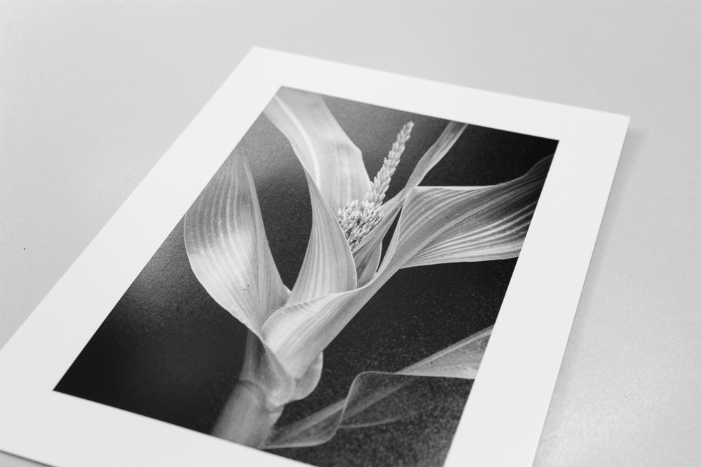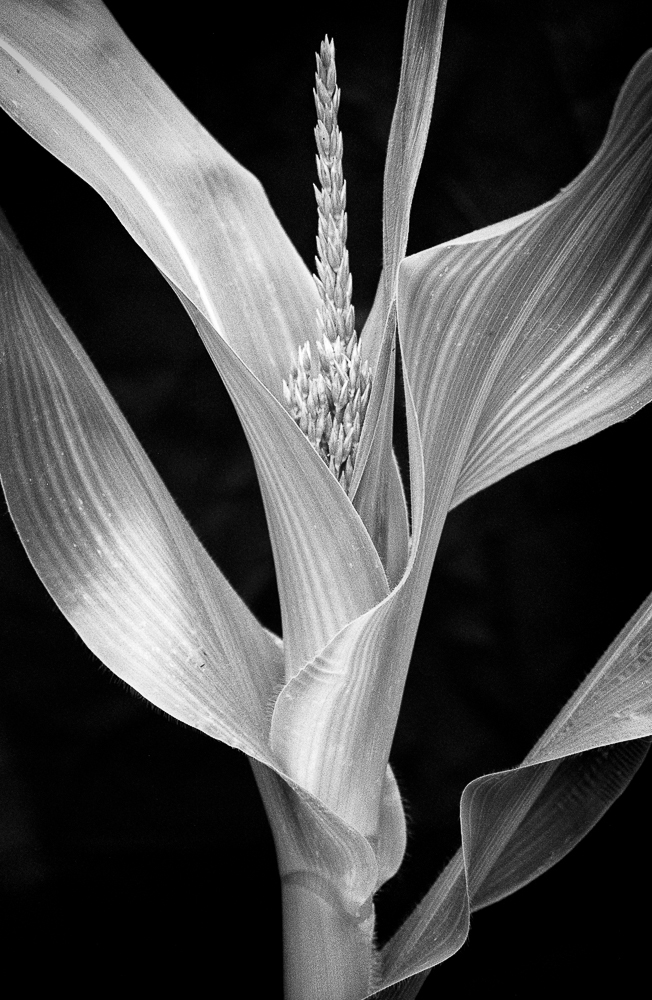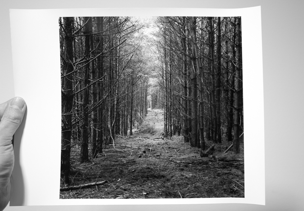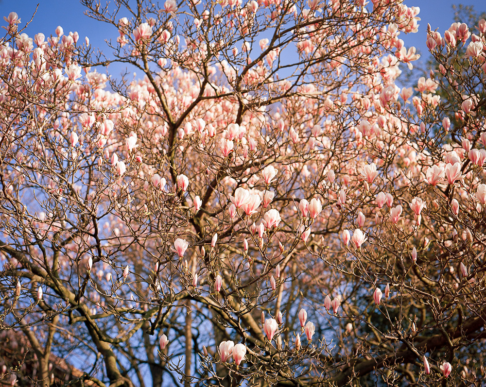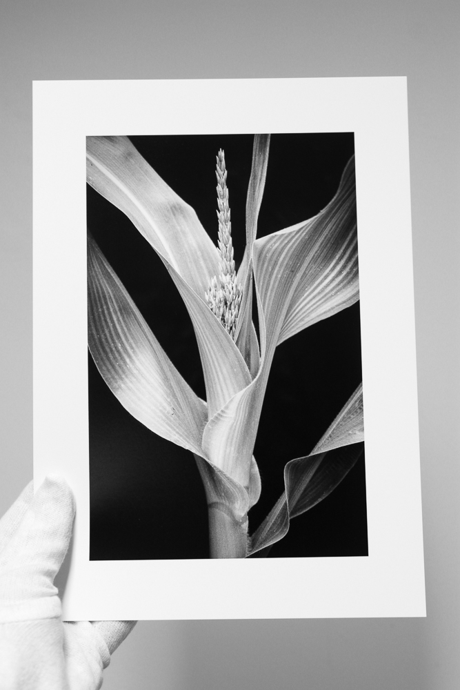
Last week I shared my Young Corn piece, shot on Ilford's HP5+ film. I have now added this as a print in my shop (please click on the 'prints' link above).
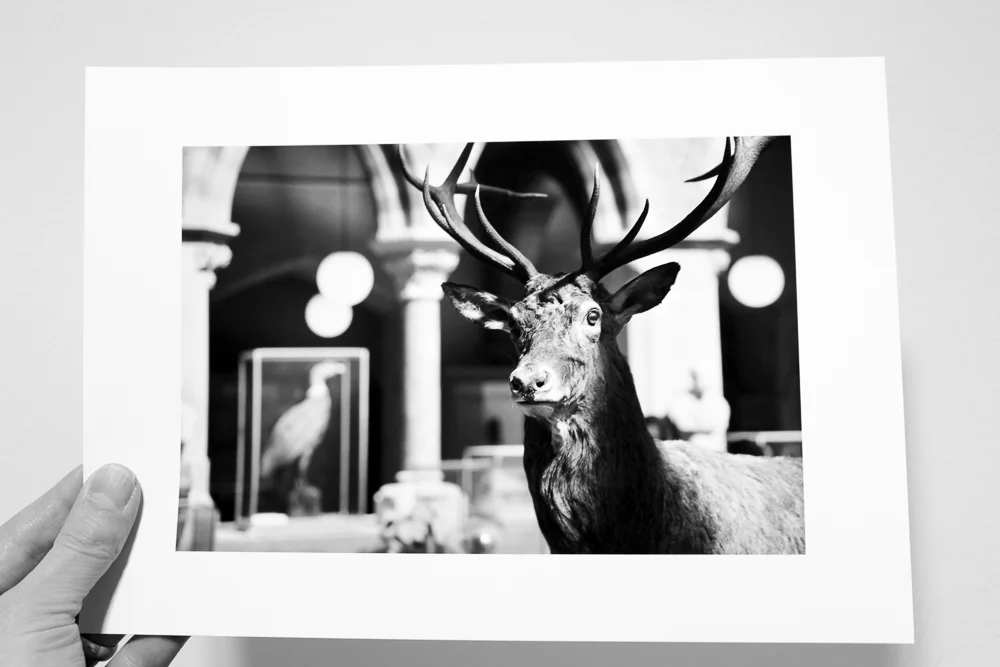
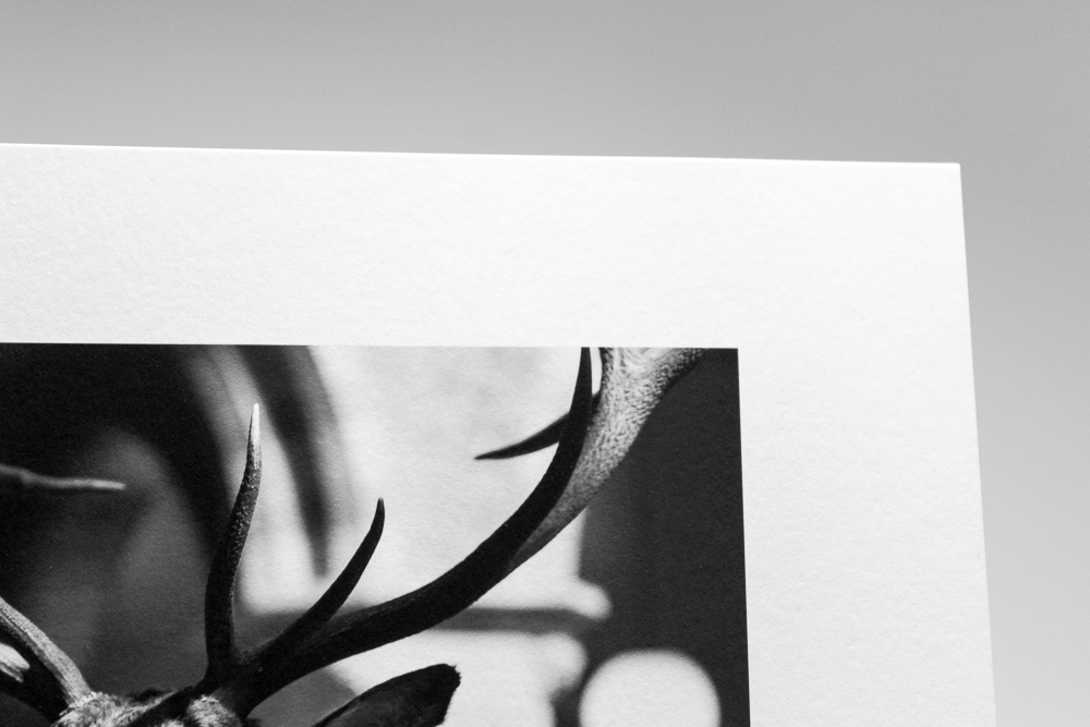
Two sizes are available, one on A4 paper and one on A3. Both have a border to allow for mounting (matting) and framing (the image of the actual print above helps to show this). I have chosen Canson's beautiful Baryta Photographique paper, an inkjet paper that gives the feel of a traditional fibre based print. I especially enjoy the rich and deep blacks that this paper has to offer, which I think suits the image, and it also produces an excellent tonal range. I wanted to reproduce the tonal rapport that HP5+ gives with this kind of subject and light. As is my customary practice, they will be signed in pencil on the rear and will come with a certificate of authenticity
In order to celebrate the launch of the print sale, I am offering my readers an impressive 50% discount for a limited time. Simply use the code CORN50 at the checkout (it will work on either size). Depending on the demand, I may close the offer relatively quickly so please don't delay if you are tempted. Shipping is free in the UK and there is a modest charge for the rest of the world. You are responsible for any taxes that your country imposes.
Please don't hesitate to get in touch if you have any questions about the print and / or offer.