24 years of refinements
I can’t be exact, but I believe I bought my Manfrotto 055 series aluminium tripod in 1993. It has served me flawlessly until this day and is still in fine working order. My recent foray into large format photography has, however, prompted me to look critically on its weight. I have no complaints about all other aspects of its performance, but there is no escaping that it is a heavy beast. Heavy tripods and field cameras are not happy bedfellows.
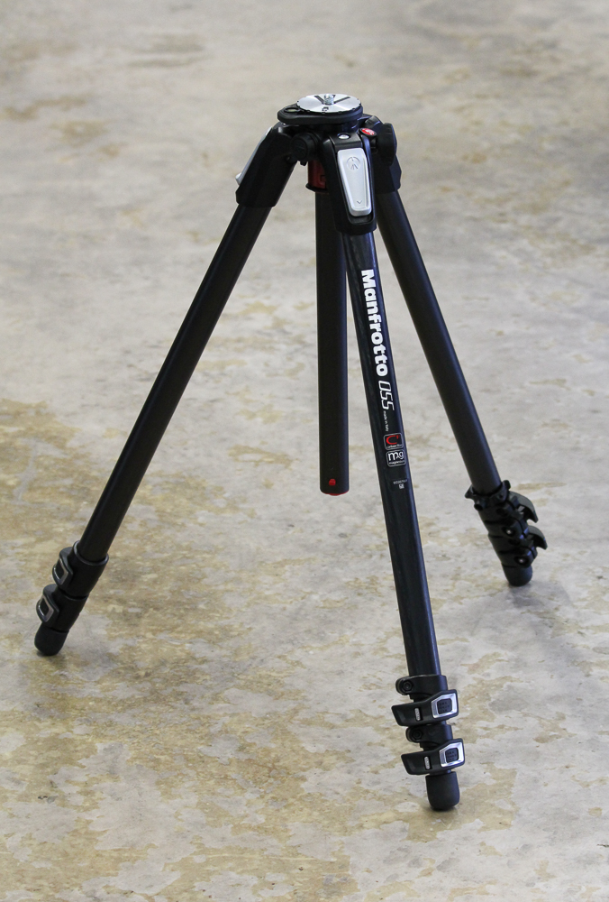
My trusty Manfrotto aluminium 055C tripod.
So it was that I determined to purchase the latest version of the 055 that Manfrotto had to offer (specifically a 055CXPRO3). This is a tripod that sits somewhere in the middle range of the market, not Gitzo price territory, nor, at around £300 at the time of writing, a budget model (and that price is for legs only; you buy the head separately). It seemed a logical thing to do, especially as my original tripod had served me so well, and the 055 is still marketed as a professional tripod designed to carry relatively heavy loads (up to 9kg - safely - according to the specifications). Even more significantly perhaps, the 055 today comes in a carbon fibre option, thus I could make use of the weight advantages of this modern material.
I don’t like twist lock legs, and much prefer the lever type. My original aluminium 055 possesses these, and I wanted to continue to use them in my replacement unit. Levers are easy to open and there is a visual check on whether the legs are locked in or not. Manfrotto have refined the design of these levers over the years and the newer model is easy to open. They are not exaggerating when they say that you can open all the sections of a leg together with one hand. One quirk of the design is that the most open part of the lever is actually the rear. It took me a little time to learn to grab the ‘closed’ side first, and to ignore the more visually inviting rear.

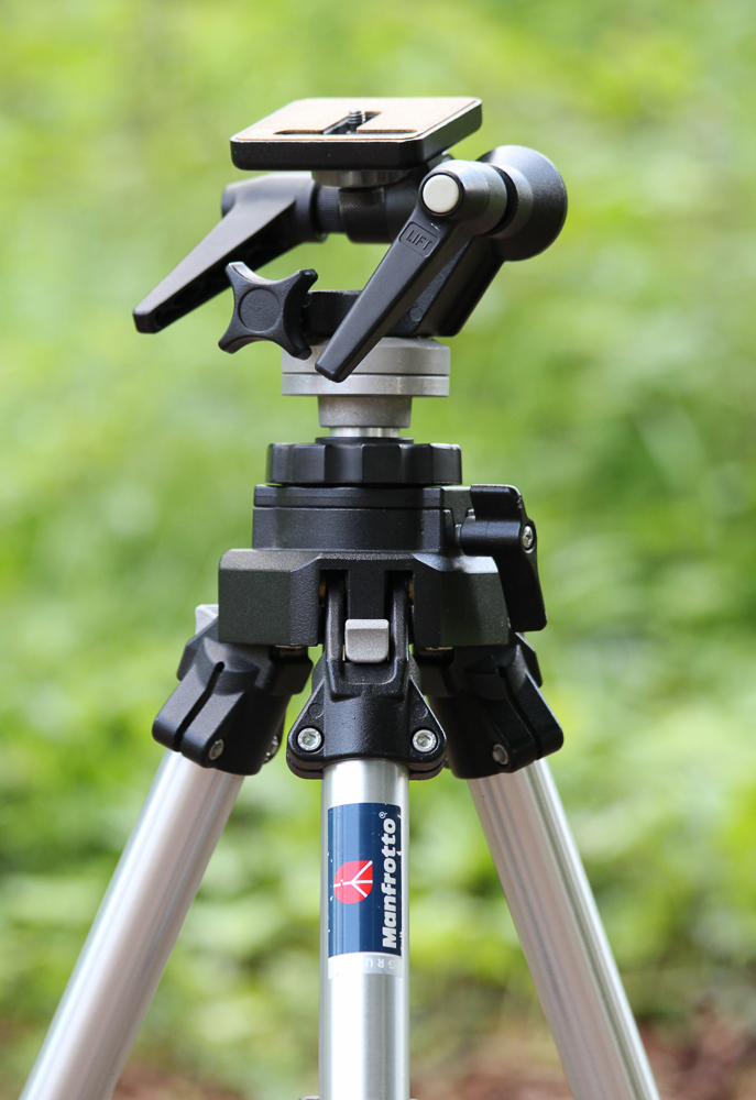
The levers, or, 'quick power locks' as Manfrotto calls them, on the 055CXPRO3.
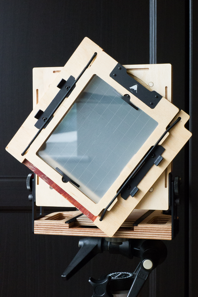
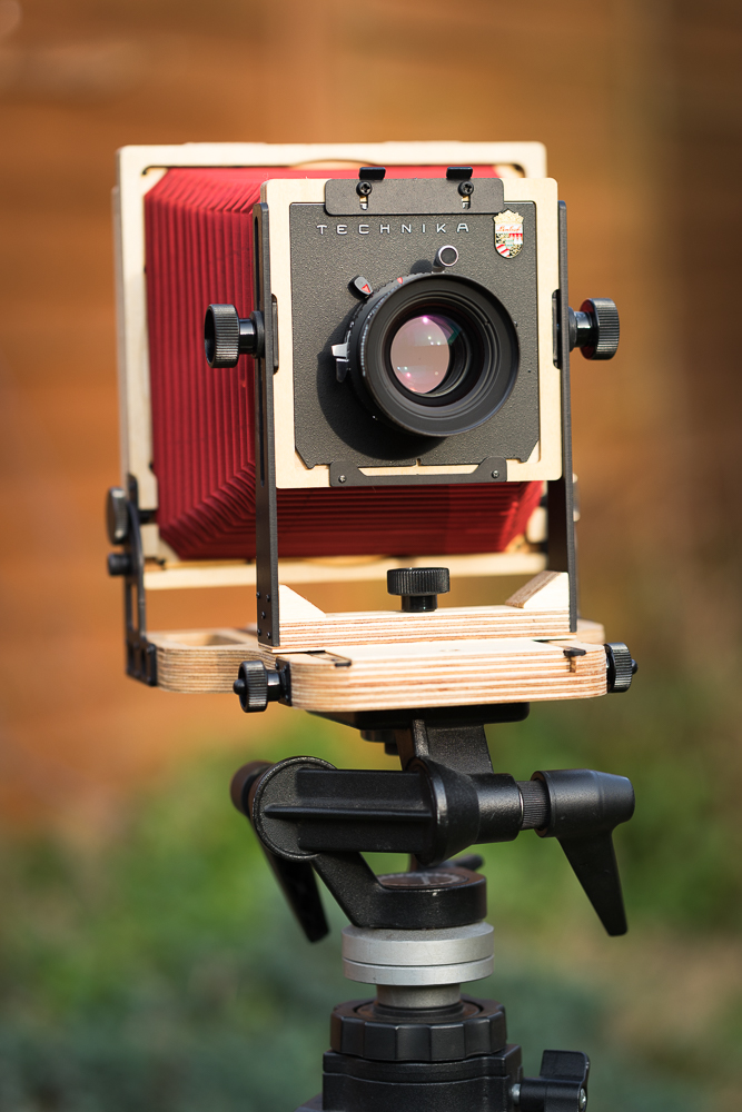
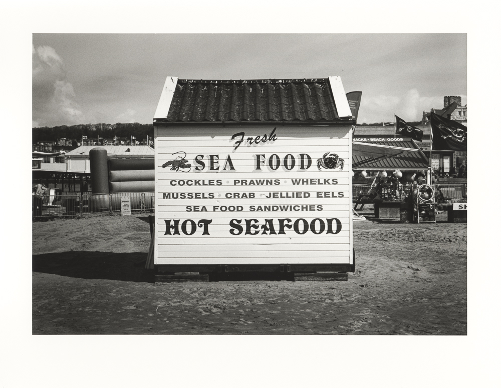
The tripod is impressively stable, even at full height with the central column extended. It stands 140cm tall, central column in the down position. This suits my height well (I’m about 5’11”), and I can comfortably work at standing height and view the ground glass of my 5x4 camera without bending or stooping (it’s worth bearing in mind that a head adds height, especially if you are looking through reviews and specifications online). I understand that carbon fibre has excellent dampening qualities and it is clear that knocks to the tripod quickly dissipate (there is more of a ‘ring’ to aluminium in comparison). As this is a mini review, a ‘first look’ really, I have done no exacting testing to confirm this stability. However, I can confirm that a 5x4 negative made using the tripod has the sharpness that I would expect from a good support.
There are two particular features that interest me less on this incarnation of the 055. The first is that you can easily switch the central column to a horizontal position, the second is a socket for attachments such as led light panels or small diffusers. Both features would be excellent for macro photographers I’m sure, and may yet prove useful to me. The socket intrigues me the most of the two, and is something I will investigate further. I have a sense that Manfrotto is giving its users some design innovations without compromising basic features and performance.
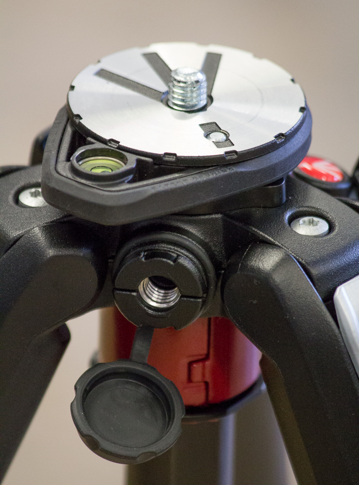
Close-up showing the adjustable spirit level (you can turn in around, so as not to clash with the head position), and the accessory attachment complete with rubber 'plug'.
So finally I come to my main reason for buying this tripod, namely its weight advantage. This isn’t a travel tripod, and it hardly shouts ‘portable’ when you first pick it up. Indeed, when it first came out of the box I did wonder if there was any real advantage over my trusty aluminium version. I think there is a certain psychology to its size and robustness that makes you think it is heavier than it is. We need to bear in mind that this is a light sturdy tripod, rather than a light travel one - a whole different proposition.
Side-by-side next to my old model the weight difference is clear. The old 055 weighs approximately 3kg, and the new one 2kg (both figures without a head attached). Numbers are all very well, but the true test comes in the field. I have really enjoyed using the new 055. You still know you are carrying something (as one would expect with a tripod for 5x4); but the significant if not fundamental weight difference, together with very slick and efficient controls, makes it a pleasure to use. In point of fact, I began to wonder if the ease of operation, even over my still very effective old model, wasn’t the most significant improvement of the newer model. It is light, yes, but it is also effortless to set up and put down. A slender difference, that, in the world of 5x4, makes a difference.
I am happy that I ungraded. A more prolonged test will come as I use it over a longer period, but for now the 055CXPRO3 Carbon Fibre Tripod is looking like a sound investment.